1. Introduction
This task reviews different design principles and applications of them. In Visual communication, we use design in order to show meaningful messages; therefore, we must apply the elements and principles of design in correct ways. Design principles are Contrast, Balance, Emphasis, Rules of Third, Repetition/Pattern/Rhythm, Movement, Hierarchy, Alignment, Harmony, Unity, and Proportion. They are Organizational fundamental tools to arrange the elements such as Point, Line, Shape, Form, Texture, Space and Color. The task also requires to choose a good design, write its credit line, enumerate the visual ideas which are observed in the design and write a brief analysis as to why it is selected.
2. Describing Design Elements
2.1 Point
Point is the most basic element, we can use it as repetitive marks, and it shapes lines, in addition it can move among spaces and make two or three-dimensional shapes.
2.2 Line
Line is created by points are as repetitive marks, line can be such as active or static, aggressive or passive, and sensual or mechanical. Line has key roles such as indicating directions, defining boundaries, and imply volumes; It is also can be unified together in order to make patterns and textures.
Plane is created by lines, that includes space and define form in a design; Planes are such as regular geometric shapes like rectangles, circles, triangles, or irregular free-form shapes. Plane transfers variety of emotions or styles.
Shape is created by expanding among the outline of a two or three dimensional objects or areas; And also it is visible by one or more lines, different values like lightness or darkness, color, and texture. Shape's categories are: Geometric shapes are such as circles, squares, and triangles, on the other hand they are very regular. And Organic shapes are such as irregular, curving an on the other hand, they are more informal.
Color is the view of light of various wavelengths falling on our eyes. It may be explained using three main segments, they are, hue, which is the simple color; value which demonstrates how light, or dark it is and varies when you add white, grey or black; and saturation, which illustrates how pure or bright it is. These parts are mixed together by designers into color schemes to bring harmony. The most prevalent ones are monochromatic, the one where colors of the same shade are used, analogous the one where colors are next to each other on a color wheel and complementary the one where the colors are opposite each other on the wheel.
Texture is the look or feel of a surface. Everything is textured, and there are two common methods of displaying texture: real texture, that can be felt physically on the surface, and fake or implied texture, which looks to be real texture, but is created using a visual effect.
Space is the area a shape or a form takes, which is divided into positive space like the filled, active spaces and negative space like the empty, surrounding spaces. The medium of the experience of space is crucial: in two-dimensional spaces, it entails flat surfaces on which designers produce the impression of the depth of space by using such tools as overlapping, size change and perspective, whereas in three dimensional space, it is real physical spaces where we feel the external mass and internal volume of an object.
3. Describing design principles
3.1 Gestalt theory
Owl Logo
Definition: Gestalt principles are guidelines which focus on how human eyes understand visual elements, and the guidelines makes complex scenes into simpler shapes or how human visually prefers to make different elements to a single group.
3.2 Contrast
Definition: Contrast means showing different kinds of visual elements strongly in order to emphasize specific points.
3.3 Emphasis
Definition: Emphasis is used to focus and highlight key visual elements by colors, shapes, and values, etc.
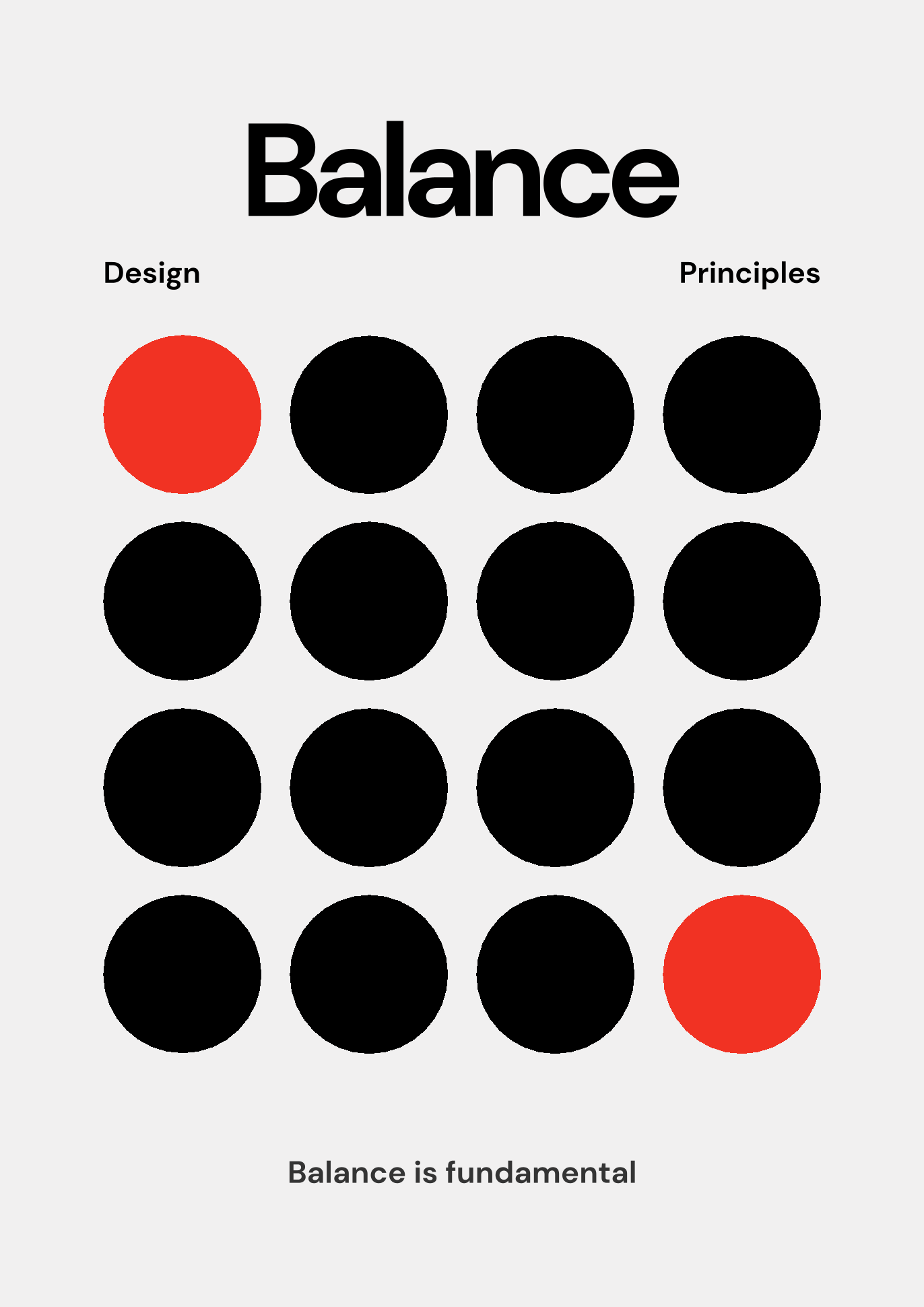
3.4 Balance
Definition: Balance a sures a suitable visual equilibrium among the elements in the design that means overall design must look balanced visually.
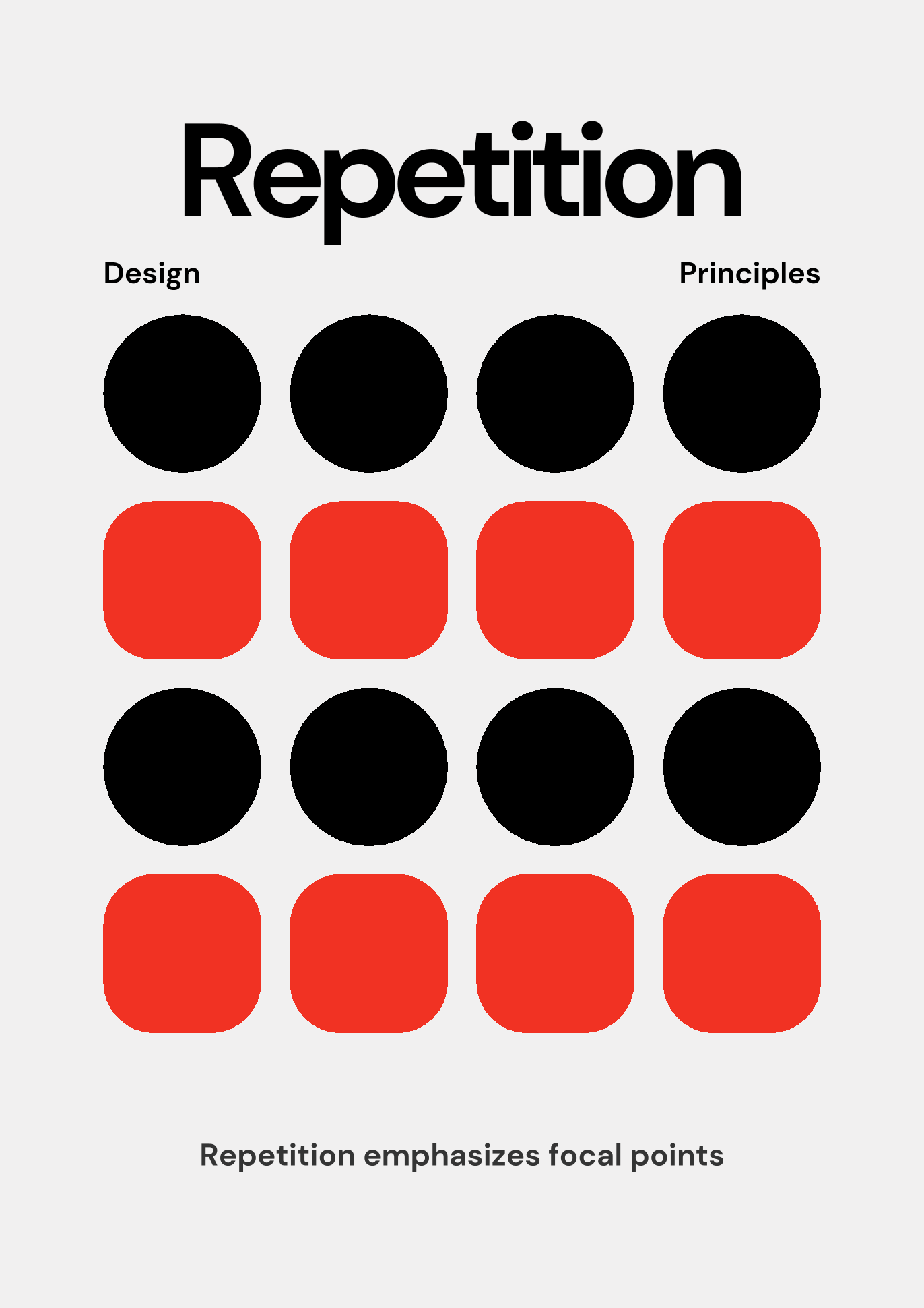
3.5 Repetition
Definition: Repetition means applying the same elements or rhythms and patterns in a design to create more visual excitement.
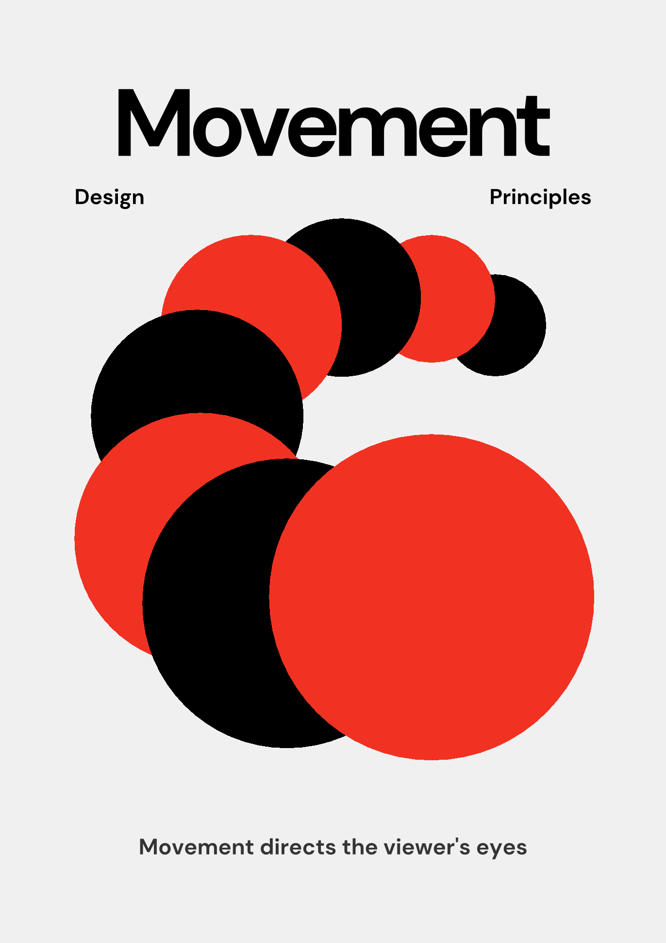
3.6 Movement
Definition: Movement refers to the way a designer can lead or guide the viewer's vision in a path for looking at the contents.
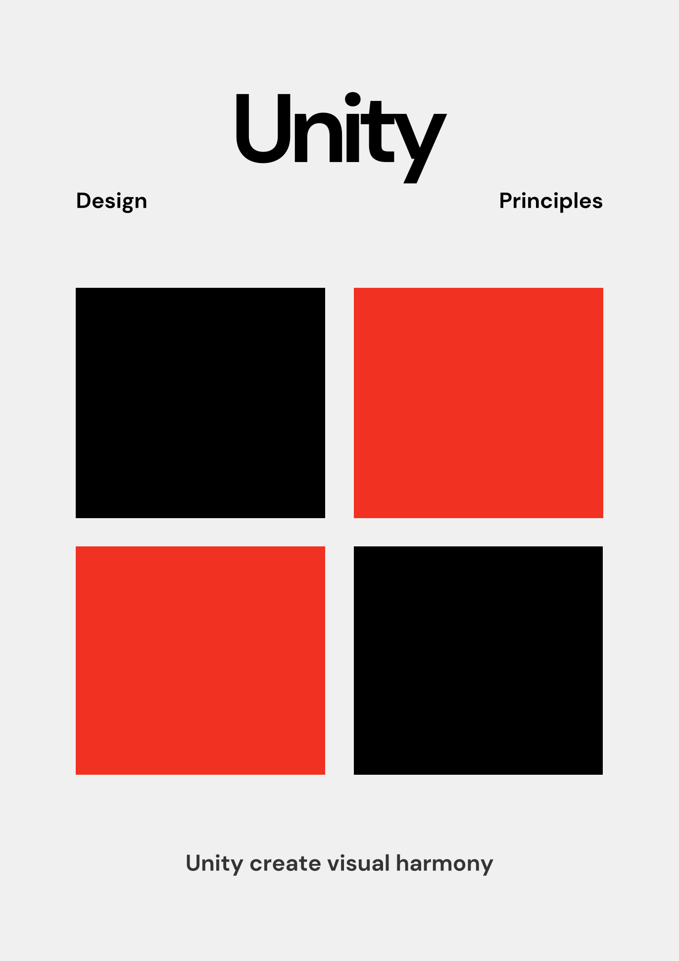
3.7 Harmony & Unity
Definition: Harmony & Unity make every element look fit together suitably which means the overall design should make sense as one.
3.8 Symbol
Definition: Symbols are signs, shapes, and objects such as logos, icons, etc. which convey information or represent another notion.
3.9 Word and Image
Definition: mixing visual elements and images with texts or words can make communication or transfer of the concepts more effective.
4. My design work of interest
Artist: @目重月 (Mu Zhongyue) / Pinned by Nuella
Year: 2025
Medium: Digital Illustration
Size: Varies (Digital file format)
5. why I chose the design?
This digital illustration of Klein Moretti in Lord of the Mysteries depicts an alternate identity of concealed secrets. The image is a classic sketch of the character in official attire in black and white, but it is interrupted abruptly by the digital glitches. It is precisely the powerful juxtaposition of a conventional portrait with glitchy graphics of error that I found intriguing. It gives the effect of mystery and mental tension. The graphic illusion appears as computer bugs, damaged information, or a crash of the computerized reality. It gives the image a creepy and uncomfortable touch. It attracts attention to the way in which concealed structures and digital layers can conceal and uncover the truth under the surface. The interest in the way machines operate combined with a discussion of deep existential concerns of how we perceive the world is demonstrated in the use of color shift errors, and pixelation. The designer demonstrates the collision of the physical and digital world by combining an old appearance with glitch art of modern times. The outcome is an introspective work that is unlike usual drawings of characters.
6. Observed Design Principles
1. Contrast
2. Emphasis
3. Balance
4. Movement
5. Gestalt Theory
7. feedback
Tutor comment: The lecturer went through my first draft and informed me that everything was good but you lacked the design elements topic.
Intervention: I edited the blog post and included a new section (Section 2). I defined the 7 key design elements, point, line, plane, shape, color, texture, and space and provided some visual examples of each of them. This assists readers to understand the fundamentals before I talk of the design underlying principles.
8. Reflection
It was a very useful introduction to the fundamentals of visual communication as a result of this exploration task. Initially, I have only been thinking about Design Principles, hence I have overlooked the Design Elements. The comments of the tutor reminded me that there is a connection between elements and principles. The basic visual words are the elements, and the rules which inform us how to put the words together in making sense are the principles.
I modified the task by adding point, line, plane, shape, color, texture, and space and this made me realize just how complicated visual design is. It also helped me to realize that all complex designs are all divisible into these simple, basic components.
Furthermore, reading the online representation of Klein Moretti made me observe how theory is applied in practice. The manner in which the artist applied the principles of contrast, balance and the gestalt theory, particularly, glitch art and a traditional portrait, helped me to realize that design concerns more than just appearance. It is a powerful means of narrating and portraying psychological tension. All in all, this exercise has immensely enhanced my attention to detail and has taught me to think of visual media in a more critical, analytical and systematic way.


Comments
Post a Comment